The components of the PayButton 2.0 mobile user interface (UI) are designed to fit seamlessly into the design of your application. You can customize the color of all components and the shape of some components. Recommendations for delivering the best user experience to clients and with some basic UI principles for meeting accessibility design standards are included in the customization details for each component.
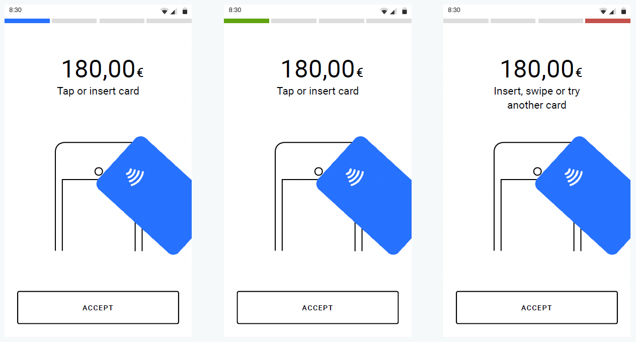
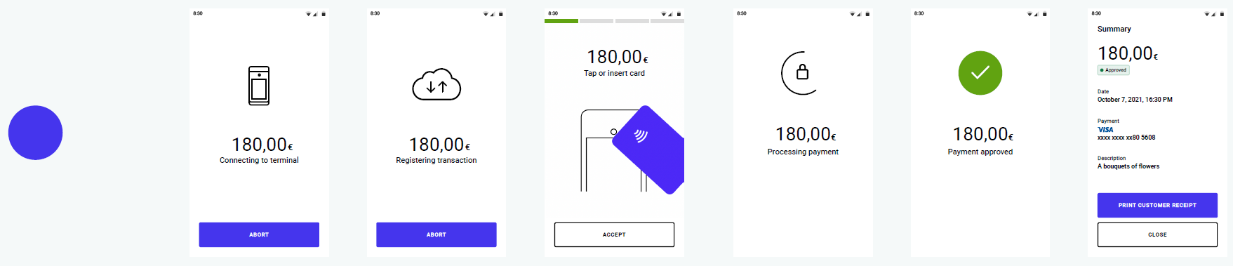
The primary color in the mobile UI can modified to fit any corporate design. The selected color is applied to all clickable, active, or selected UI components and present-card animations, including text and icons. The default primary color is blue (#3974FC), as shown in the example below.
To meet accessibility design standards and to provide the best user experience for your clients, the recommended color contrast ratio is 3:1 for the primary color components. The following examples show different primary colors applied to the PayButton 2.0 Integration mobile UI.
Primary Text Color and Outlined Buttons
The primary text color can be changed to a variety of different colors. Changing the primary text color will also affect the color of the outlined buttons and their icons. To meet accessibility design standards and to provide the best user experience for your clients, the recommended color contrast ratio is 3:1. Examples of the primary text color and outlined buttons are shown below.
Primary Button Text and Animation Details
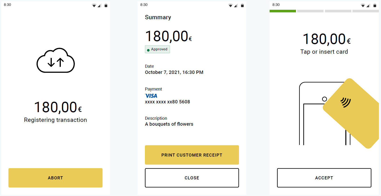
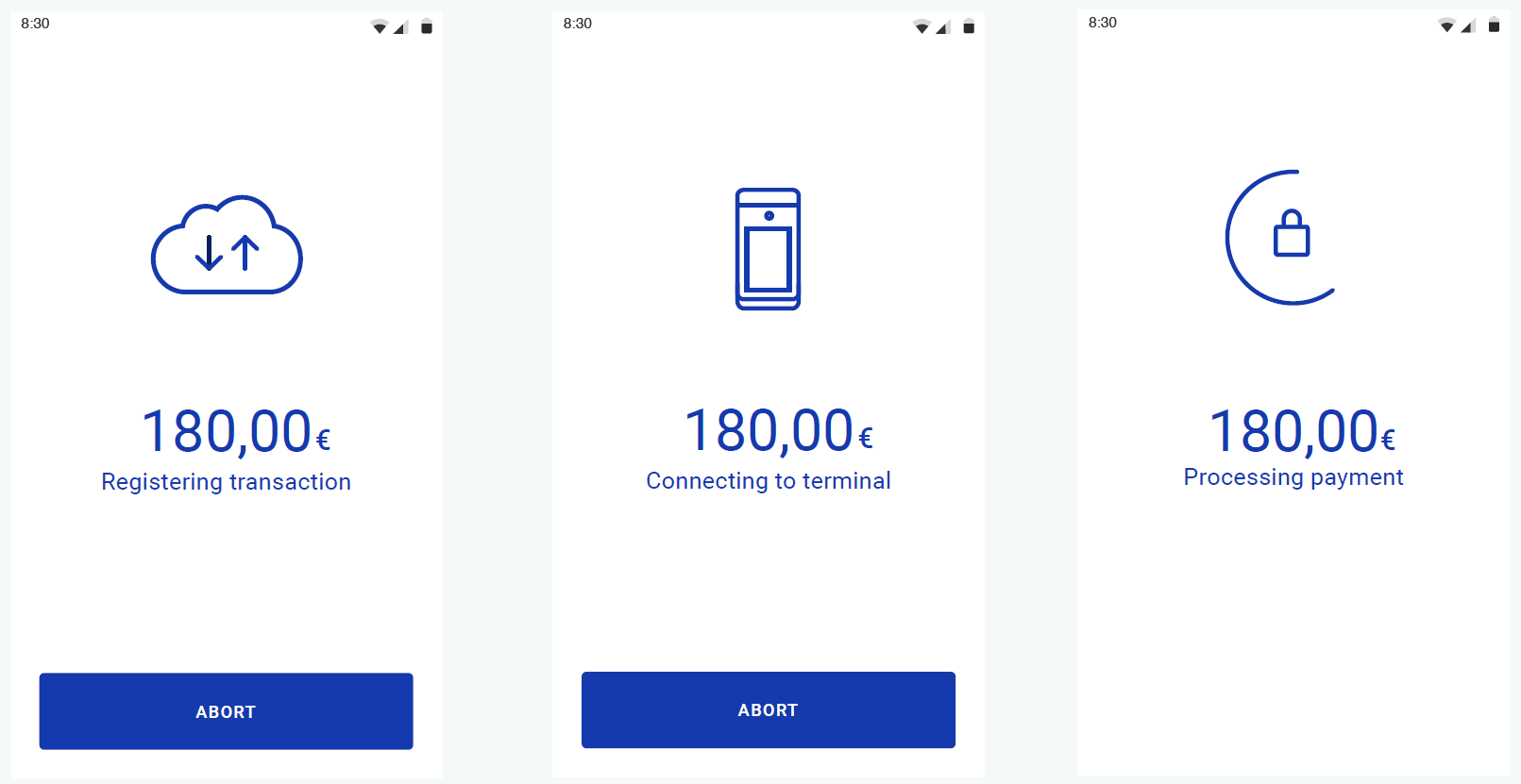
The default color for UI components displayed on top of primary color components can be changed to any desired color. The selected color is applied to the filled button text and animation details. To achieve the best user experience and to meet accessibility standards, the recommended contrast ratio is 3:1. Examples of the primary button text and animation details are shown below.
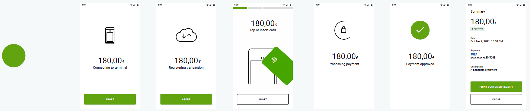
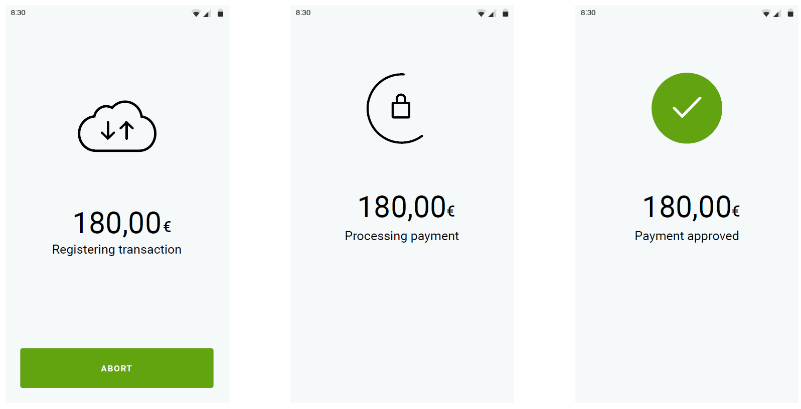
Transaction Animations and Icons
The default color of the transaction animations and icons can be changed to a variety of different colors. To achieve the best user experience and to meet accessibility standards, the recommended contrast ratio is 3:1. Examples of the transaction animations and icons are shown below.
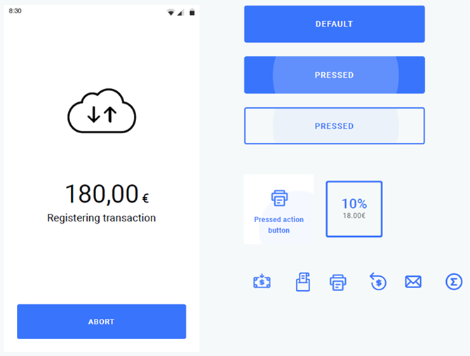
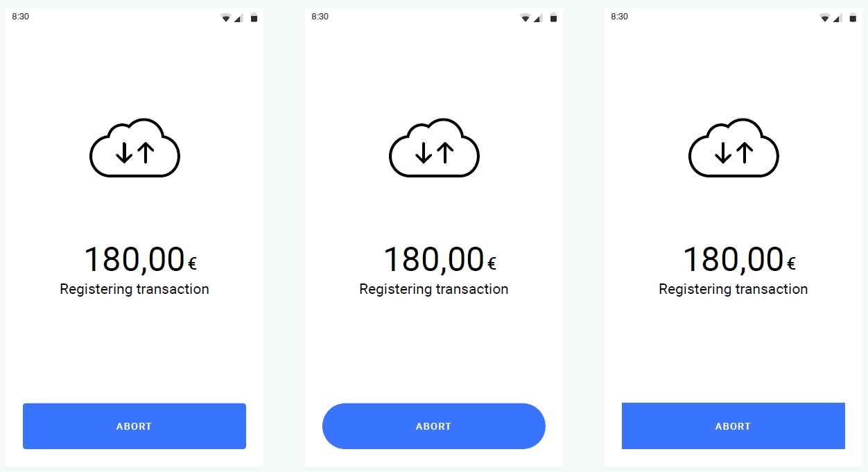
The mobile UI button corner radius is set to
4
by default. The corner radius of the buttons can be changed. Examples of the Abort button with slightly rounded, rounded, and squared corners are shown below.
The background colors for the mobile UI screens can be changed to fit your corporate design. The default background color is white. Examples of a customized background color are shown below.
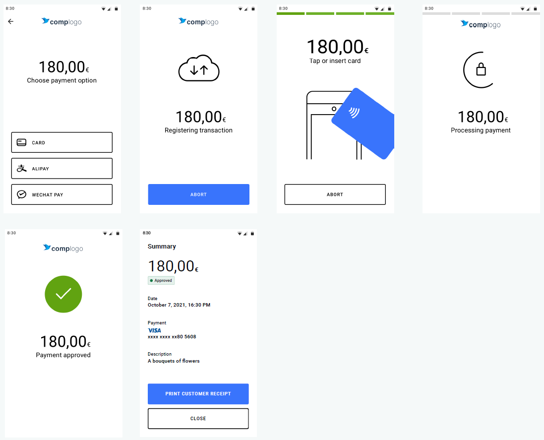
A company logo can be applied to many of the payment flow screens. The following logo format will provide the best resolution result on the screens:
Size: 140 x 36
Format: SVG or PNG
Examples of how a company logo displays on the payment flow screens are shown below.
Contactless Visual Status Indicators
The default colors for the contactless visual status indicators are green for success and red for error. These colors can be changed to fit your corporate identity. However, red or a similar color is recommended for error states. Examples of different colors applied to the contactless status indicator are shown below.
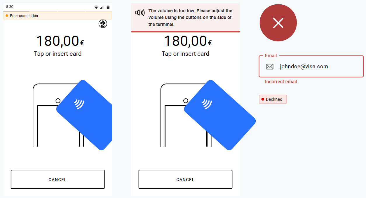
Notifications and Error Messages
The recommended color for error icon and text message UI components is red. Although the alert notifications and error message icon and text colors can be changed to a variety of different colors to fit your corporate identity, changing these colors will also affect the color of the following components:
Alert notification colors (typically yellow)
Red transaction animations (white cross on red circle)
Entry field error states
Declined transaction badges on the Summary screen
Examples of notification and error messages using the default colors are shown below.