UI Style Element | Description |
|---|---|
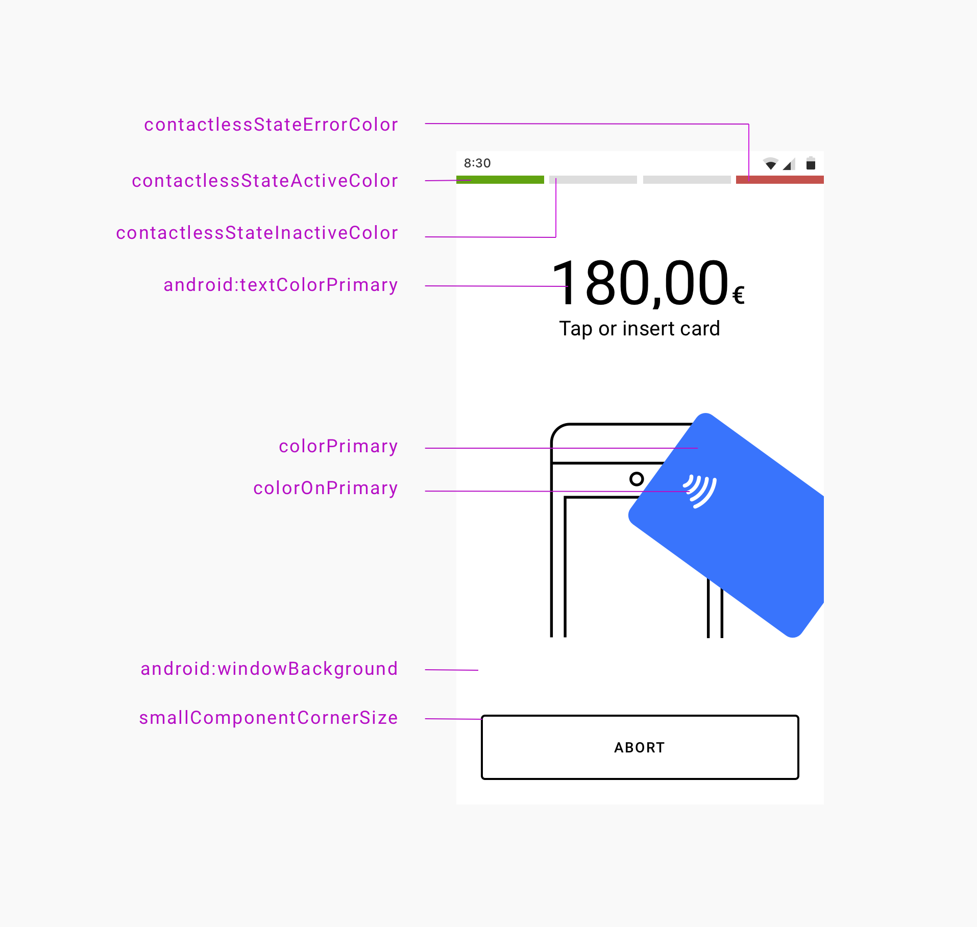
contactlessStateErrorColor | Error indicator color that displays when a problem occurs with the device attempting to read a card on the contactless interface. |
contactlessStateActiveColor | Active indicator color that displays when the contactless interface is ready or when a payment card is tapped on the device. |
contactlessStateInactiveColor | Inactive indicator color that displays when the contactless interface is not active. |
android:textColorPrimary | Primary color for the text that displays over the background color. For example, the transaction status badge text. Also, the primary color for the outlined button borders. |
colorPrimary | Primary color that displays for the filled buttons and animations. |
colorOnPrimary | Primary color that displays for the filled button text and animation details. |
android:windowBackground | Background color that displays for the window. |
smallComponentCornerSize | Defines the corner radius of the buttons and transaction status badge. For example, set this element to 0dp for square corners, 4dp (default) for slightly square corners, or 32dp for round corners. |
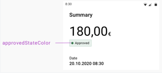
approvedStateColor | Indicator color that displays for the approved transaction badge and animation. (Not shown in the UI display example above.) |
declinedErrorStateColor | Indicator color that displays for:
(Not shown in the UI display example above.) |
preAuthorizedStateColor | Indicator color that displays for the pre-authorized transaction badge. (Not shown in the UI display example above.) |
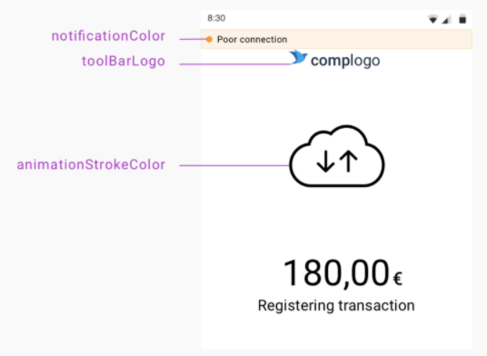
notificationColor | Alert notification color. Displays with "Poor connection" and "Low battery" notifications. Default color is yellow. |
toolBarLogo | A drawable (such as a PNG image) used for the merchant's company logo that displays during payment option selection and transaction status updates. |
cardPresentAnimationStrokeColor | Overrides animationStokeColor (shown in UI display example above) in the card reader drawing on present-card animations. |
<!-- Paybutton theme -->
<style name="Theme.AppTheme.SampleTheme" parent="Theme.PayButton2">
    <!-- Text color -->
    <item name="android:textColorPrimary">@color/black</item>

    <!-- Background color -->
    <item name="android:windowBackground">@android:color/white</item>

    <!-- Contactless indicators -->
    <item name="contactlessStateActiveColor">@color/pb_green</item>
    <item name="contactlessStateInactiveColor">@color/pb_light_gray2</item>
    <item name="contactlessStateErrorColor">@color/pb_red</item>

    <!-- Transaction status -->
    <item name="approvedStateColor">@color/pb_green</item>
    <item name="declinedErrorStateColor">@color/pb_red</item> <!-- Also used for error messages and dialogs -->
    <item name="preAuthorizedStateColor">@color/pb_dark_gray</item>

    <!-- Filled buttons and animations primary color -->
    <item name="colorPrimary">@color/pb_blue</item>

    <!-- Used over the primary color, for text on filled buttons and details on animations -->
    <item name="colorOnPrimary">@color/pb_white</item>

    <!-- Corner radius for the buttons and transaction status badges -->
    <item name="smallComponentCornerSize">4dp</item>

    <!-- Company logo -->
    <item name="toolBarLogo">@drawable/logo_140x36</item>

    <!-- Stroke color for icons and animations -->
    <item name="animationStrokeColor">@color/pb_black</item>

    <!-- Stroke color for terminal in present card animation. By default the same as animationStrokeColor -->
    <item name="cardPresentAnimationStrokeColor">@color/pb_black</item>
</style>
mposUi.themeRes = R.style.Theme_AppTheme_SampleTheme
mposUi.setThemeRes(R.style.Theme_AppTheme_SampleTheme);